Monday, May 1, 2017

Gallery walk.. (special edition)

In the the SXU art gallery to view the the senior sem students work they been working on for a while. I came across two individuals I know Kolin and Giselle. I would like to discuss their pieces for a bit.


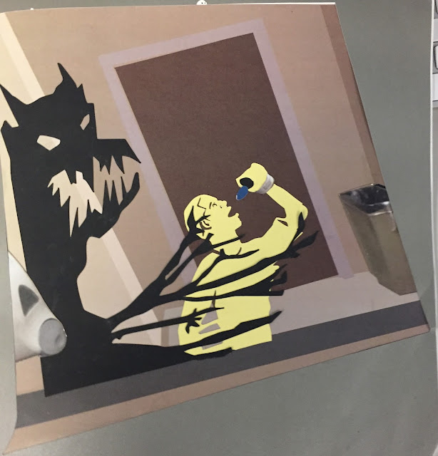
"squad supper"
This piece is my favorite out of the collection of art he created because kolin took the concept of the last supper with jesus and friends to a remix of him and all of us he is friends with.. including me.. even tho i don't look like that.. and I laughed when he got the caption above me saying "don't piss me off".. my fav line.. But seriously, great job of using the concept in your own form and medium... lts a classical theme but with a modern digital look to it..use of blue and redish purple lines .


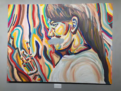
"self portrait of Giselle Villasenor"
sorry i couldn't add the ascent on your last name Giselle but your piece was quite interesting with the gray paint stroke across the mouth and the use of big line colour brush strokes to the portrait .. its almost trippy and interesting of how you used the colours as to create your piece.. I'm wondering if this is acrylic paint or oil to create...but over all its such a beautiful self portrait.


Art institute (special edition)

Now Last week on Thursday, I did an Art museum date to the art institute.. throughout the time being there and look at all types of art.. different mediums.. different types.. just from classical..abstract.. representational..etc.. I came across two piece that I just had to talk about in my opinion. of how I thought of the pieces.
Jacques-Antoine Volaire
"The Eruption of Vesuvius"
Oil on canvas
 Now this piece I absolutely love.. apologizes on terrible camera angle... but the uses of reds.. oranges.. blues... the detail is just so beautiful to me.. its like chaos in the night time scenery.. that blows my mind.. and the detail from the sky of the moon.. withe clouds being illuminated by the moons shine.. to the eruption and fiery of the volcano.. its just ughhh.. Im jealous and intrigued and.. influenced to do more with my art and explore mediums like oil on canvas
Jackson Pollock
"The Key"
Oil on linen
this piece well.. its interesting on the idea of abstraction.. but what i hate about is that the fact.. the name of it doesn't make sense to me... I try to look at try to find an understanding of this piece... i just couldn't find it.. sometimes I feel abstract art is just like child playing with colors on paper.. with lines and different strokes of brushes and different sizes.. and color... this piece in my opinion is just not pleasing to me.. I feel this artist either just was bored.. or experimenting with some drugs and wanted to do art on drugs...

my art discussion ( special edition)

This post is me discussing pieces of my own art
"aesthetics"
2017
Prisma coloured pencils 
Bristol vellum paper
I created this piece from an reference picture I randomly found on google and i thought it would be interesting to make my own interpretation and style to the image.. I started sketching out the image lightly..Then with color of different tones of brown.. tans...reds.. yellows... pinks.. getting much detail and realism as possible.. so when I thought of name it just appeared in my head as aesthetics..

"Shanya's roses"
2017
Prisma coloured pencils
Bristol Vellum paper
I created this piece from the thought of my my queen favorite flower, which is roses, I went on a search for different roses and i just end up picking too that I thought would be very vibrant and beautiful and intriguing to look at.. I started with a sketch as always.. then begin with details of the first rose on the left with hues of yellow.. orange.. red.. pinks.. uses of violets.. purples.. green tones for leaf.. then the next the right rose.. uses of pink values.. and light purple with touch of dark red but almost purple tone.. with hint of pinks. 

week 15 final project

This final piece was created from all the collective themes and objectives we learned over the whole semester in 2d ... from photograph.. Photoshop.. illustrator and paper cutter aspect. it started from the idea of war.. I went with the idea of war but in my way with my interior war with depression.. the never ending battle.. i started with a sketch.. then a stencil... cut it out then went on to use photographs of my images.. convert to an illustration on photoshop. Then print. next I print the images to use photo aspects..
 The most challenging part was creating good stencils and making sure that my message is displayed through my art..


Sunday, April 30, 2017

week 14 sketch idea

so for my final piece i have to created three 12x 12 size sketches of what I'm going to created that will be related to the word and idea of war
I wanted to contribute my battle of depression into my final piece since it relates to war but its interior war within myself


Monday, April 10, 2017

week 13-more stencils again?.. improvement?

Okay This time i had to use the same three colors and pattern or thick paper.. but i wanted to add more detail.. and then created a perfect stencil having all the black touchings... heres the progress.. Sorry still couldn't find the stencil with the nike sign.. I basically had to create it on silhouette studio and then create outer and inner outline of the shoe.. have a cut out for the first layer and second layer...


week 12- stencil improvement-three color pop with pattern paper

So next piece I had to improve on the next idea i have created on it.. this time it had to either use pattern paper or thicker paper.. i used both and wanted to take the feedback from classmates and from nathan to add more detail to the shoe .. I couldn't find the other stencil files but heres the stencil to the red dark colour to the newspaper paper.. and black background..


week 11-more stencils?

The next piece we had to used the ideas from the last asignment.. this time use three colors.. basically like the color pop assignment... I wanted to created a stencil using my favorite shoe.. AJ1 show I created a black and white stencil of the shoe.. and i couldnt find the stencil with the nike check sign logo.. but heres from the photo to stencil to final piece with a tan paper and orange outline to black background..


week 10 - stencil to cut and create two color illustration

The next piece I had to create was a stencil BW logo or object with the all the blacks touching to show that the black area are the ones to be cut out when using the silhouette program..
Once i was able to draw it out as the black and white image below .. I sent it to illustrator to save as a jpg.. then sent it to the silhouette studio to be traced.. then sent to my usb as a the silhouette file to be cut on the silhouette cutting machine..


For this two pieces i basically used a light and dark blue.. the light blue was used to be cut out.. for the white part.. postive space.. and i used the dark blue for background to give the identical look to the stencil that i created...

the piece below was the cut outs of the light blue .. I glued on to the dark blue background two give the identical black and white but inverted


Sunday, March 19, 2017

Week 9 photograph to illustration

This week assignment was based on using the images we photographed with interior and exterior distance... we clearly had to take the images to illustrator and then pick a good area in the image as our foundation or base... starting from the background of the image to the front .. using the pen tool to make a shape of the objects then eyedropper for the color..You are basically making your interpretation of the photograph.. in your way.. from photo to illustrator.. 
" Winter wonderland"
2017
digital
illustrator, pen tool, eyedropper


"Stairwell"
2017
digital
illustrator, pen tool, eyedropper


Monday, March 13, 2017

week 8 interior distance and exterior distance

Sadly, I was nowhere near anything interesting to take fantastic or abstract images of interior and exterior distances but I got the idea of it..
Exterior Distance
I wanted to just get a view of the campus from distances with using the trees and buildings.. show layers of depth


 Interior distance
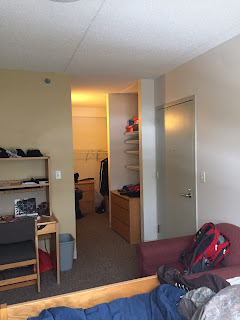
I wanted to give a view of the dorms and the distance.. not long distance but enough to give layers of background


Friday, March 3, 2017

week 7 text, frame, color dull

due to the fact of missing class i cannot completely explain the assignment i just know how to create the images
anfaslim
2017
photoshop edit
i wanted to have a theme of this rad graffiti like low budge skater feel to this image .. with use of a graffiti like text and the same complementary colors 

kickflip
2017
photoshop edit
I wanted to keep the feel of the target image of the skateboard with a hint still of the theme graffiti

young jag
2017
photoshop edit
I wanted to incorporate my bestfriend rapper name in here with the use of the low budget feel to it like its a cheap magazine to read off of 

Monday, February 27, 2017

week 6 color pop

the images below are created from photography to photoshop edits
skateboy
2017
photography
photoshop edit
i wanted to focus more on to the skateboard of the image because even with regular color you still focus on the skateboard more than anything else in the photo

supersaiyan
2017
photoshop edit
i used this image because i wanted just goof around but mainly the use of the name came from dragon ball.. and plus im the only human object in the image so might as well highlight my ass to be more focused on

yellowed bridged
2017
photoshop edit
i used this image because it contained two subjects.. jordan and the bridge and i mainly wanted to focus hugely on the bridge by using complementary colors of yellow and purple


Monday, February 6, 2017

Week 5 Explore Representation/abstraction

this week we explored abstraction and representation 
view below
charger adapter
2017
digital drawing 
this image used complementary colors green and red and the values behind the image... idk why i use an adapter but i thought it was interesting to draw  

"light bulb"
2017
digital drawing
this use of pink values was interesting and make it useful.. and realistic almost.. its a energy color light bulb.. it was the purple one but i changed it to all pink.. im not sure why but i enjoy it..

"flowers"
2017
digital drawing
once again complementary color .. orange and blue values with a realistic view to the image above.. 
"ball"
2017
digital drawing
idk why i drew a ball or a sphere it just reminded me of how art class you always have to draw out a 3d sphere with shading and realism feel to it
"this is art"
2017
digital drawing 
I always thought the human body is art.. especially the female physical body is art to me its beauty.. not sexualizing it just noticing it as art 


rest of the images was activities done to an image from either drawing or illustrator usage